
NetbreakersWEBSITE DRAFTS
Three directions for your website
Same pages, same words, same tools, three different looks. Click into each one, scroll all the way down, and tell us which one feels like you. We can also mix pieces from each.
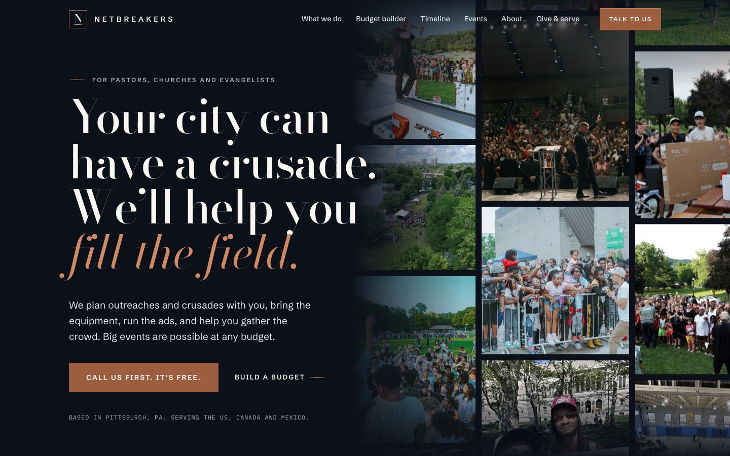
Option A
Campaign ledger
Dark navy with tall, bold headlines and copper as the fire. The map is the star: dots light up in order as a counter ticks up, like a ledger of every outreach.
View Option A →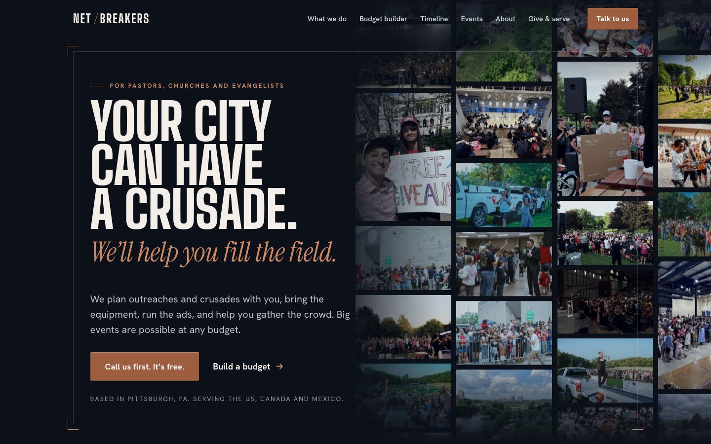
Option B
Crusade poster
Feels like a printed crusade flyer on real paper. A hand-knotted net holds taped photos in the hero, the way a net holds a catch.
View Option B →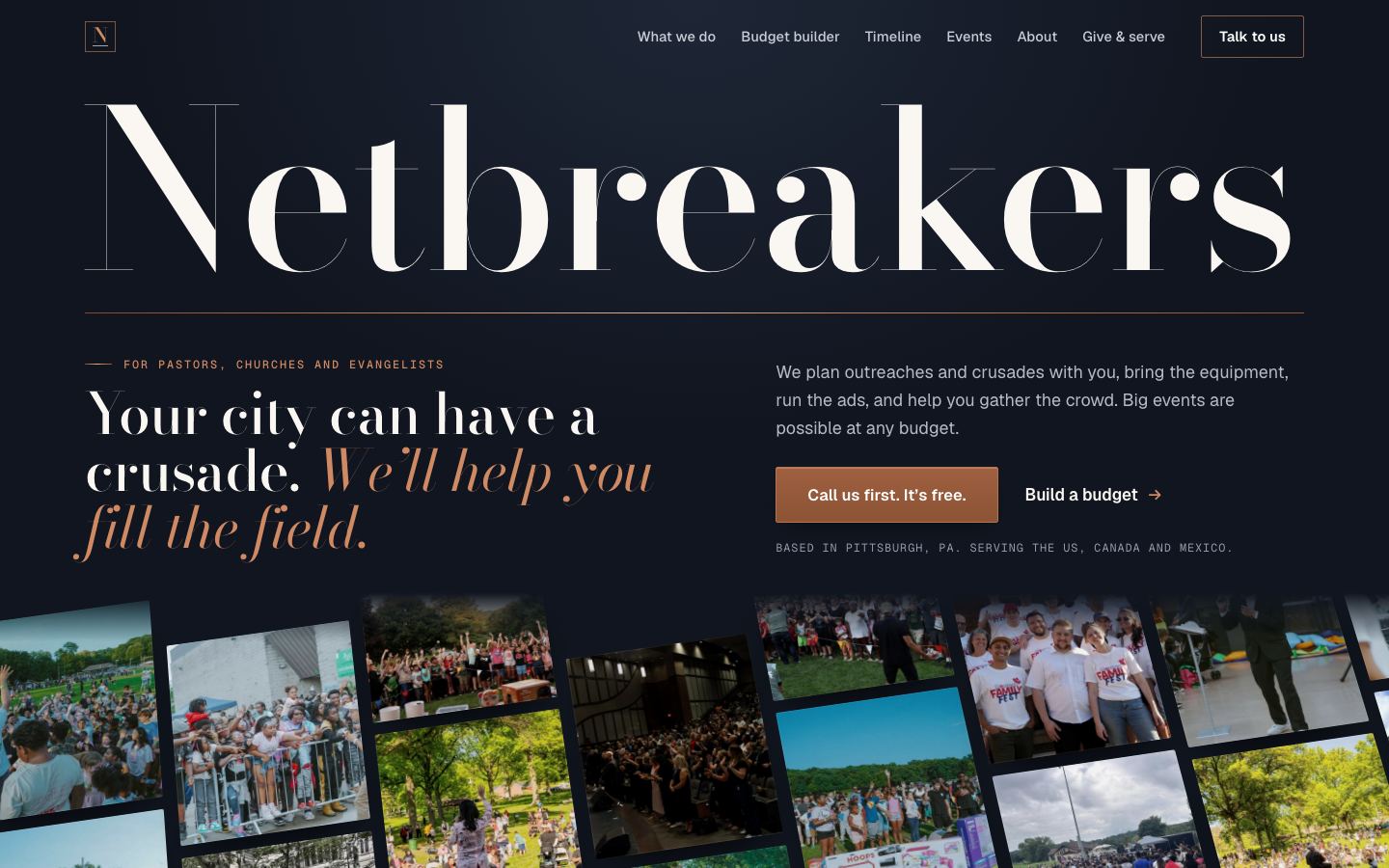
Option C
Bright mosaic
Light, clean and joyful. A huge Netbreakers name over a big, slowly drifting wall of outreach photos. Closest to the Kaloi and LettrLabs references.
View Option C →